

In today’s short lesson, we’ll review GEO Maps using Google Data Studio.
What are GEO Maps?
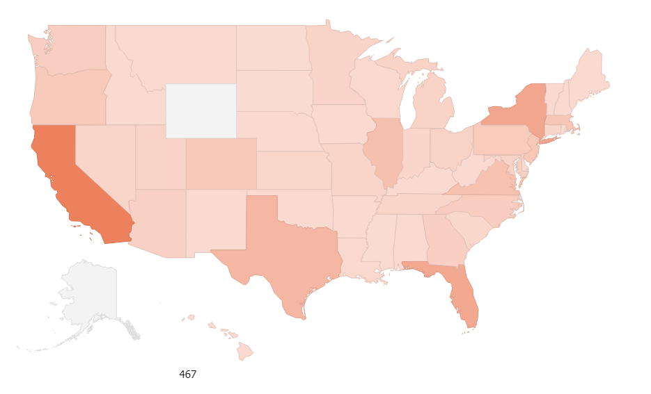
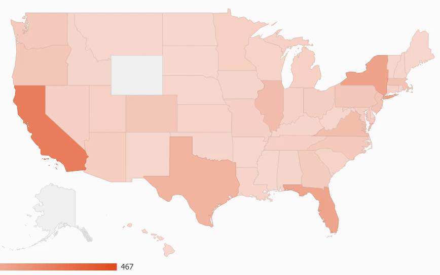
Geo Maps in GDS are a map-style visual chart which is used to display data which is location based. Typically, we use GEO Maps to show traffic, conversions, leads, revenue, and other metrics based on where the end user is. Here’s a sample:
GEO Map Dimensions and Metrics
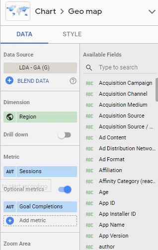
GEO Map Dimensions
Since GEO maps are meant to display location-based data in Google data Studio, the dimensions which can be shown are typically related to continent, country, region (aka state), and city. These dimensions can all be targeted and should be chosen based on the target audience of the data which you are analyzing. That is, if you’re a small local car wash, you would ideal focus on local city maps. Alternatively, if you’re marketing a multi-national lead generation website, your ideal view would be worldwide.
Map Drill Down
GEO maps are interactive which means that you can provide the user with the ability to drill down into specific GEO dimensions. For example, if you want to provide the end-user with a map of the USA and allow them to also see city specific data, you can add a drill down hierarchy for this.
First, here’s what it looks like from the edit screen. Here, you can see that you need to engage the drill down option and then select the secondary dimension. In this case, we want the user to be able to drill into a region (aka a state) to see city-level data.
On the front-end, here’s how the end-user can engage with the drill down with a simple right-click.
GEO Map Metrics
For GEO Maps, the dimensions are limited to well, GEO dimensions. Metrics though, can be any metric, regardless of scope. Commonly though, we like to report on high-level metrics such as:
- Sessions
- Users
- Goals
- Ecommerce
- Etc.
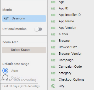
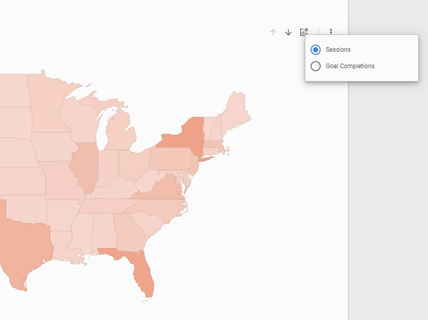
Optional Metrics
Now’s a good time to mention a metric-specific setting in GEO Maps which allows for optional metrics. This is used to allow the front-end user to switch the metric for which the map reports easily. For this, you’ll have to engage optional metrics and then choose the other metric for which the end-user should be able to report.
On the editing side, it looks like this:
On the front end, the user engages with optional metrics just by using the selector at the top-right of the chart.
I hope this tutorial helps explain the GEO Map charts in Google Data Studio. Please posts questions below!
Resources
Thanks for the great tutorial.
One quick feedback that I thought that would be nicer is that being able see the actual excel data format.
Hi Rick,
I had a question regarding geo maps. I wanted to use the geo maps zoomed on Kenya specifically. Is it possible to do that, because the example that you shared doesnt allow me to zoom in on Kenya as it doesnt has Kenya as that zoom option ? Do you know if it is possible in some other, maybe by using latitude and longitude information ?
Hi Hardeep,
I’ve tried every which way. I have no idea why Kenya is not an option. The best I could find is setting GEO to country and zoom to East Africa like this: https://share.getcloudapp.com/7KuRnLO2
Hi, I need some questions:
1. Can I import locations points with lat long information.
2. How can I import line and polygon data
Regards
Pete
Hi Pete. You can import lat and log but not to data studio. You’d need to import to a table in Google Sheets (or similar) and then query from there.
I don’t think I understand #2, can you please re-state?
Hi!, I have a table with latitude and longitude. I loaded it into google sheets and from there I tried to create a map in DataStudio. It didn´t pick the two parameteres.
Any suggestion?
Hi Ana,
After you added the columns in your GSheet, did you go back to GDS (data studio) and refresh the fields by editing the data source?
Hi Rick,
I have imported LAT & LONG of indian states but it didnt catch up 4-5 lat&long. Also it is showing Co-ordinates on the map but i want the names of state. Please help me
Hello Rocky,
I think this link may help. Google wrote a FAQ Guide on how to create a calculated field.
https://datastudio.google.com/u/0/reporting/1cYhmgipdgqkQkni6qTzMfn0CqJ–OY6D/page/8wpQ
Let me know if this is what you are looking for!
Chris